
Before a guest sees the ceremony setting, hears the music or raises a glass, they hold a small piece of your celebration in their hands. Wedding stationery is not merely a practical announcement. It is the first quiet expression of the atmosphere you are creating – a glimpse of the light, texture, place and feeling that will shape the day.
For couples drawn to a luminous, natural and timeless celebration, paper can do more than carry information. It can make a destination wedding in Provence feel sun-warmed before anyone has packed a suitcase, or suggest the candlelit intimacy of a winter dinner in a historic town house. The loveliest suites feel considered rather than overworked: personal enough to belong only to you, yet clear enough to make every guest feel beautifully welcomed.
Begin wedding stationery with a feeling
The most compelling stationery begins before you choose a font or save a pin. Start with the emotional impression you hope guests will carry away. Perhaps it is a slow, garden-led weekend with long tables under olive trees. Perhaps it is the quiet grandeur of an old European hotel, softened by silk ribbons and low candlelight. Or perhaps your vision is contemporary and sculptural, with crisp typography, generous white space and a palette drawn from stone, sea or evening sky.
Try describing your celebration in three to five words. “Italian, warm, tactile, effortless” offers a more useful direction than “rustic”, which can mean almost anything. “Parisian, restrained, romantic, editorial” gives your stationer a clear visual language without asking them to replicate a single image.
This is also where restraint becomes valuable. A suite need not contain every colour, motif and idea from your wedding. One strong thread, repeated with sensitivity, is more memorable than a collection of competing details. A blind emboss inspired by your venue’s architecture, a painted edge in the tone of your bridal shoes, or an illustration of the chapel entrance can say far more than an invitation crowded with decoration.
Build a paper story, not a matching set
Wedding stationery has a rhythm. The save the date introduces the occasion; the invitation provides the formal welcome; the on-the-day pieces guide guests through the celebration. They do not need to be identical, but they should feel as though they belong to the same story.
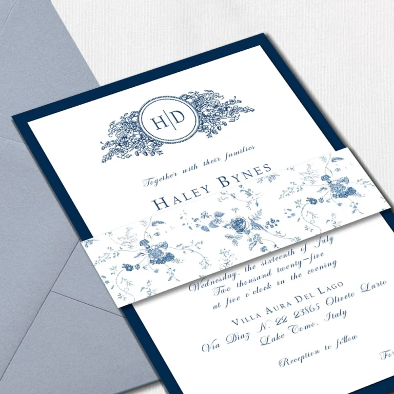
A monogram or crest can provide continuity, particularly for a multi-day destination celebration. So can a recurring botanical detail, a particular typeface pairing, or a measured palette of two or three tones. For a refined result, allow each item its own purpose. The save the date may be pared back and modern, while the invitation suite brings in deckled edges, silk-lined envelopes or a venue illustration. At the wedding, a menu might feel more intimate on softly textured stock, while table names are best kept legible and calm.
Think beyond the main invitation too. Welcome notes, weekend itineraries, ceremony programmes, menus, escort cards and small handwritten messages can make the experience feel gently held together. This does not mean every possible item is necessary. If you are hosting a simple city ceremony followed by supper, an invitation, menu and place cards may be all that is needed. For a three-day celebration abroad, a beautifully organised itinerary can be an act of genuine hospitality.
Let the venue guide the details
The setting should influence the paper, not dictate a literal theme. A lakeside villa might suggest watercolour washes, blue-grey ink and handmade paper with a soft edge. A London restaurant with moody interiors may call for deep espresso tones, clean letterpress and a menu with an almost tactile weight.
Avoid the temptation to add obvious icons simply because they relate to the location. A lemon motif can be charming for the Amalfi Coast, but it can quickly become expected. Instead, look for subtler references: the local stone, ironwork on a balcony, the curve of a window, the hues of the surrounding landscape. These are the details that give stationery a sense of place without turning it into a souvenir.
Choose materials for the way they feel
A beautiful suite is as physical as it is visual. Paper weight, printing method and finishing touches change the experience of opening an envelope. This is where luxury often reveals itself – not through excess, but through materials that feel considered in the hand.
Cotton or handmade papers bring softness, depth and a gently imperfect edge that suits painterly or romantic designs. Smooth card stocks create a cleaner, more contemporary impression and allow typography to take centre stage. Vellum can add a whisper of translucency when used as an overlay, while a silk or velvet ribbon offers warmth without requiring further embellishment.
Printing deserves similar attention. Digital printing is versatile, precise and often the most sensible choice when you have a detailed illustration or need to manage a careful budget. Letterpress presses type or artwork into the paper, creating an impression guests can feel; it is exquisite for restrained layouts, but fine details and large areas of ink may not reproduce as intended. Foil brings a beautiful light-catching quality, although it works best as an accent rather than a dominant feature.
There are practical trade-offs. Handmade paper can be less predictable for certain printing processes and may require hand calligraphy or carefully selected envelope addressing. Wax seals are romantic, but they can become damaged in the post unless protected. A stationer should be able to guide you through these decisions, balancing beauty with the realities of production and delivery.
Make information feel elegant and effortless
Even the most artistic invitation must help guests understand what is happening and when. Clear wording, thoughtful hierarchy and honest timings are part of good design. If the ceremony is adults only, if transport is provided, or if guests need to arrive early for a boat crossing, share it with warmth and clarity.
For celebrations involving travel, a details card or wedding website can preserve the invitation’s sense of space while giving guests the guidance they need. Accommodation suggestions, airport information, dress guidance and weekend plans are especially helpful when guests are navigating an unfamiliar destination. Keep the main invitation focused on the essential moment; let supporting information do the quieter administrative work.
Names and addresses also deserve care. Formal etiquette can be lovely, but the wording should reflect your relationships and your celebration. There is no need to adopt language that feels remote simply because it appears traditional. The most graceful choice is usually one that feels natural to you and considerate to those receiving it.
Plan the timing with room for craft
Custom stationery rewards early decisions. Begin speaking with a stationer roughly six to nine months before the wedding, and earlier for complex suites, calligraphy, bespoke artwork or an international celebration. This gives space for creative development, sampling, proofing, printing and the occasional unforeseen delay.
Save the dates are commonly sent six to twelve months ahead, particularly when travel or peak holiday periods are involved. Invitations generally follow around three to four months before the day, though destination guests may appreciate more notice. Your stationer can help shape a schedule around your RSVP date, but remember to allow time for addressing, assembly and posting.
Order more than you think you need. A small reserve covers late additions, keepsakes, photography and any envelopes that go astray. Reprints can be costly, especially with letterpress, foil or handmade papers, and exact materials may no longer be available later.
The details guests remember
Guests may not recall the exact shade of ink, but they will remember the sensation of being anticipated. A welcome card that explains the weekend with warmth, a menu that makes the meal feel like an occasion, or a place card carrying a sincere note can create that feeling. These pieces turn logistics into atmosphere.
If your budget requires choices, invest first in the invitation suite and the pieces guests will hold closest during the celebration. You can simplify signage, use one well-designed menu per table, or choose digital printing for secondary items. Cohesion matters more than making every element ornate.
Let your stationery be an intentional piece of art, but allow it to remain useful, readable and true to the two of you. When the last envelope is opened, the most beautiful design is the one that makes your guests feel they have been invited into something deeply personal – and wonderfully worth celebrating.
9 Comments