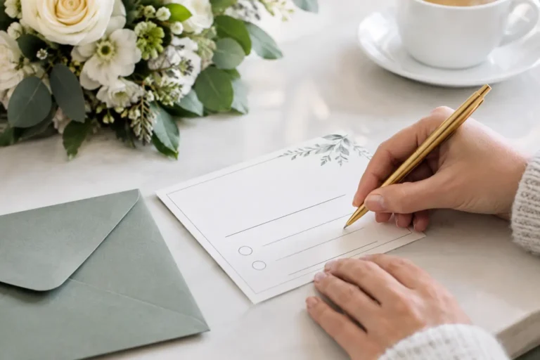
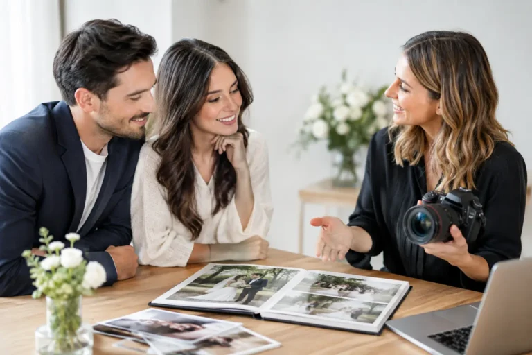
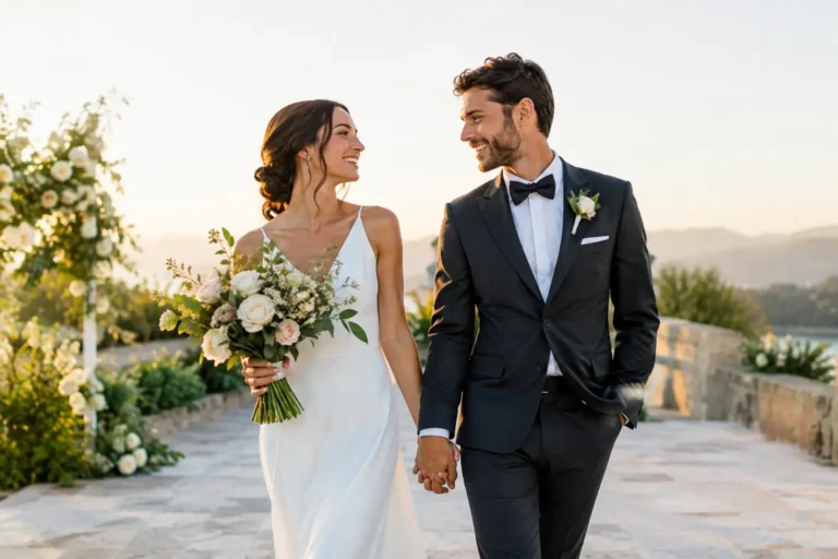
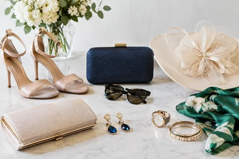
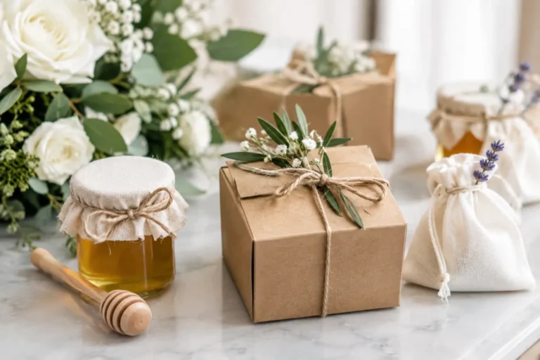
A saved image of a sunlit villa, a silk bow, a dramatic tablescape and a handwritten menu can each be beautiful. Together, however, they may be telling four different stories. The real purpose of a moodboard is not to collect every lovely thing you encounter. It is to create a cohesive wedding moodboard that gives your celebration a recognisable atmosphere before a single stem is arranged or invitation is printed.
For couples drawn to editorial imagery, the challenge is rarely a lack of inspiration. It is learning when to stop collecting and begin curating. A well-considered board becomes a quiet point of reference for every decision that follows, from the linen beneath the plates to the way your photographer approaches the final hour of light.
Begin with the feeling, not the palette
Before selecting photographs, name the emotional quality you want guests to carry away. Perhaps it is the intimacy of a candlelit dinner in an old stone courtyard, the ease of a summer lunch by the sea, or the soft formality of a city celebration with champagne, sculpture and cream roses. This is more useful than beginning with a colour such as sage or blush, because colours alone cannot define an experience.
Try completing one simple sentence: “We want our wedding to feel…” Choose three to five words, then look for images that genuinely support them. Words such as luminous, gathered, understated, joyful, poetic or sun-warmed give a much clearer brief than a broad aesthetic label.
This is also where your own story belongs. The place you first travelled together, an inherited piece of jewellery, your shared love of French cinema or long, late dinners with friends can offer a far more enduring starting point than a passing trend. Personal references need not be literal. A memory of lemon trees on holiday might become a citrus-toned menu, textured linen and a scent carried through the reception rather than an overt Mediterranean theme.
Create a cohesive wedding moodboard with an edit
Start broadly, then reduce decisively. Gather around 30 to 40 images from different categories: ceremony settings, fashion, flowers, stationery, tables, food, lighting and candid moments. Include a few images that show movement and people, not just perfectly set tables. A wedding is lived in, and your board should reflect both its visual beauty and its warmth.
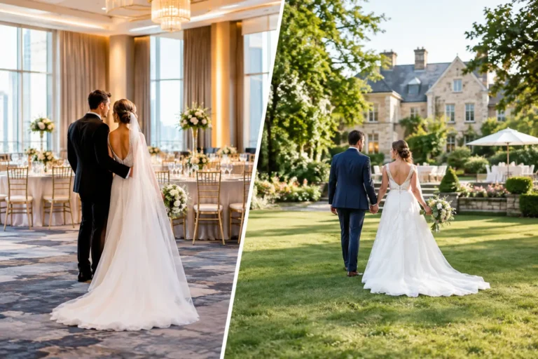
Then make a second, more discerning edit. Aim for 12 to 18 images that feel as though they could belong to the same day. If an image is striking but introduces a conflicting mood, let it go. A maximalist floral installation may be exquisite, but it will pull against an otherwise restrained, architectural vision. Equally, a very formal ballroom image may feel out of place beside a relaxed countryside lunch.
I often suggest choosing one “anchor” image: the photograph that expresses the atmosphere most completely. It might be a twilight ceremony beneath plane trees, a bride in a softly structured gown, or a table set with rippled glass and taper candles. Every other image should either reinforce that direction or reveal how it translates into a different detail.
The goal is not sameness. Cohesion comes from a shared visual language, not from repeating identical shapes or shades. A sculptural ceramic vessel can sit beautifully beside delicate floral arrangements when both feel tactile, quiet and considered.
Look for the visual threads already present
Once your edit is in place, notice what repeats. You may see warm ivory rather than bright white, aged brass rather than polished gold, loose garden roses rather than tightly arranged blooms, or soft shadows rather than high-contrast imagery. These recurring details are the beginnings of your design language.
Pay attention to texture as carefully as colour. Silk, handmade paper, raw linen, translucent glass, stone, polished wood and trailing foliage all create atmosphere. Texture is particularly valuable when you want a restrained palette to feel layered rather than flat. A wedding in ivory, oat and soft green can feel remarkably rich when the materials have depth.
Build a palette that has room to breathe
A useful wedding palette is usually less about choosing many colours and more about assigning each one a role. Select a foundation shade, a supporting neutral, one or two accent tones, and a subtle darker note that creates definition. For example, warm ivory and parchment may form the base, muted olive can bring in the landscape, butter yellow adds life, and espresso ribbon or typography introduces contrast.
Avoid treating every colour equally. If every shade appears in the flowers, stationery, bridesmaids’ dresses, candles and tableware, the result can feel overly designed. Let the palette move naturally through the day. Perhaps the ceremony is light and tonal, while dinner gains depth through coloured glassware, fruit or candlelight.
There is no rule that says a moodboard must be neutral. A vivid red, cobalt blue or marigold celebration can be just as refined, provided its use is intentional. The question is whether the colour supports the feeling you named at the beginning. Bright tones suit a spirited, celebratory atmosphere; they may be less fitting for a quiet, misty garden vision.
Let the venue shape the design
The most persuasive wedding moodboards respond to a real place. A historic London dining room, a Provençal estate and a coastal Scottish marquee each bring their own light, scale and character. Rather than trying to transform a venue into something else, allow its strongest qualities to guide your choices.
Study the permanent features: the wall colour, flooring, window light, chairs, landscape and architectural details. If your venue has ornate gilding and rich panelling, pared-back florals and modern typography may provide balance. If it is a blank canvas, you have more freedom, but also more responsibility to create warmth through lighting, textiles and furniture.
This is where the difference between aspiration and practicality matters. A reference image shot in an Italian courtyard may be beautiful, but its sun-bleached palette and alfresco abundance will need thoughtful adaptation for a November celebration in Britain. Keep the essence – perhaps the abundance, intimacy and candlelight – rather than copying every visual detail.
Translate images into decisions
A moodboard becomes useful when it can guide your suppliers without becoming restrictive. Alongside the images, add brief notes about what you are responding to. Instead of saying “I want this bouquet”, write “movement, seasonal flowers, soft cream with a few deeper accents”. This leaves room for your florist’s expertise and for the best stems available at the time of year.
The same approach works for photography, stationery and styling. Tell your photographer that you are drawn to gentle natural light, unforced interaction and tactile close-up details. Tell your stationer that you love deckled paper, restrained typography and an imperfectly tied silk ribbon. A clear moodboard gives creative partners direction while allowing them to make work that feels original.
It can help to separate your board into two layers. The first is the emotional and visual world: light, place, colour and texture. The second is practical application: dress code, floral scale, table styling, cake finish, menu presentation and signage. The first keeps the celebration meaningful; the second prevents a beautiful idea from being lost in small decisions.
Know what does not need to match
Not every element needs to appear on the moodboard, and not every detail should be perfectly coordinated. The most memorable weddings have a little ease to them. Your grandmother’s silverware, a favourite fragrance, a spontaneous speech or a slightly imperfect handwritten place card may bring more character than another decorative layer.
Consider where to spend your visual energy. For an intimate dinner, the table, lighting and food presentation may deserve more attention than a dramatic ceremony backdrop. For a destination weekend, welcome details and a relaxed gathering the evening before may matter as much as the reception itself. Cohesion is about prioritising what guests will feel, not styling every surface.
Before you finalise the board, test it with one question: could a person who has never met us understand something true about us from these images? If the answer is yes, you have moved beyond a collection of trends and towards an intentional piece of art. Let that sense of recognition, rather than the pressure to make every detail perfect, guide the celebration you create.