
The moment an invitation is lifted from its envelope, your guests begin to feel the wedding before they see it. The weight of the paper, the softness of a deckled edge, the quiet gleam of foil against warm ivory stock: luxury wedding invitations are not simply a way to share a date. They are the first physical expression of the atmosphere you are creating together.
For a celebration shaped by intention, the invitation suite should feel less like a separate task on the planning list and more like the opening page of your story. It can hint at the stone façade of a Tuscan villa, the candlelit intimacy of a London supper, or the airy romance of a coastal ceremony. The most memorable suites do not rely on excess. They use material, typography and detail with restraint.
What Makes Luxury Wedding Invitations Feel Exceptional?
Luxury is often mistaken for ornament alone. Foil, wax seals and silk ribbon can certainly be beautiful, but their impact depends on whether they belong to the wider design language of the day. A suite feels genuinely elevated when every choice has a reason: a hand-torn edge that echoes the softness of a garden ceremony, a blind emboss that mirrors the architecture of the venue, or an illustration that makes a destination feel immediately personal.
Craftsmanship is central. Consider the difference between a digitally printed card and letterpress pressed into thick cotton paper. Digital printing can offer remarkable detail and is often a sensible choice for watercolour artwork or tightly managed budgets. Letterpress, meanwhile, leaves an impression you can feel. It lends even the simplest typographic layout a sense of permanence.
The same principle applies to paper. A fine invitation does not need to be excessively heavy, though substantial stock has a pleasing presence. Texture matters as much as weight. Soft cotton, lightly flecked handmade paper, crisp vellum and laid paper each hold ink and light differently. Ask to see paper samples in daylight before deciding. A cool white that feels perfect on a screen may seem stark beside candlelight, while a warm cream can bring an immediate sense of ease.
Begin With the Feeling, Not the Embellishments
Before choosing colours or print techniques, name the feeling you want your guests to carry from the invitation to the ceremony. Perhaps it is sun-washed and understated, formal but not rigid, quietly celebratory, or intimate and cinematic. This single decision will make the many subsequent choices far less overwhelming.
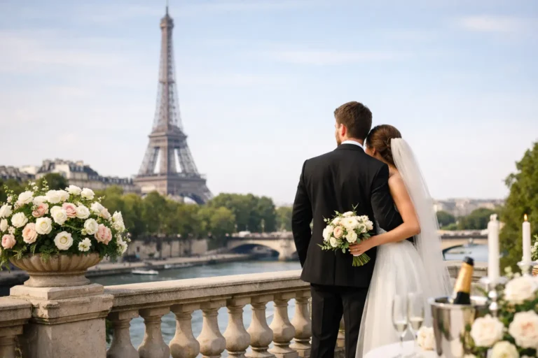
For a French-inspired celebration, that feeling might be expressed through graceful serif typography, pale stone tones and a fine venue sketch rather than overtly Parisian motifs. For a weekend in the Cotswolds, you may lean towards tactile paper, mossy greens and relaxed calligraphy. A black-tie city wedding could call for deep ink, generous spacing and a sharp, architectural monogram.
The invitation should also speak honestly about the event. A highly formal suite sets an expectation of formality, so it may feel disconnected if the wedding is an easy-going lunch in a family garden. Equally, a casual postcard may undersell a carefully planned evening of champagne, strings and candlelight. There is no universal formula. The right degree of refinement depends on the rhythm of your celebration and the people you hope to gather.
Build a considered visual thread
Choose two or three visual anchors and let them carry the suite. These may be a restrained palette, a monogram, an illustrated motif, or a particular typographic pairing. Trying to feature every lovely idea usually weakens the result. A vellum wrap, painted liner, ribbon and wax seal can be exquisite together, but only when the composition still has room to breathe.
I often encourage couples to notice the smaller visual cues already present in their plans. The curve of an arched doorway, the olive branches at the ceremony, a favourite textile from your home, or the tiles of the place where you got engaged can all become meaningful starting points. These references make a design feel collected rather than copied from a trend board.
Choosing Print, Paper and Finishing Details
A carefully edited suite can combine different methods, but each technique should be chosen for what it contributes. Letterpress gives typography depth and character. Flat foil creates a refined glint without the pressure of letterpress, while digital foil can be useful for intricate artwork. Thermography has a raised finish that suits traditional designs, although its shine may not be right for every modern editorial look.
Blind embossing, where an image is pressed into the paper without ink, is among the most understated choices. It is particularly beautiful for a monogram, crest or subtle border. Used with a warm white stock, it can feel luminous and beautifully quiet.
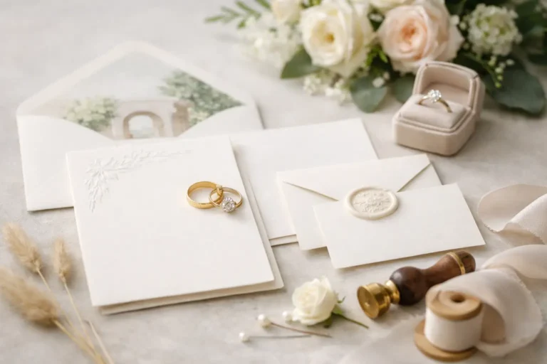
Finishing details are where tactility comes alive. A hand-dyed silk ribbon introduces movement and softness. A bespoke envelope liner offers a private moment of colour or pattern. Wax seals are lovely for a smaller guest list or an inner envelope, but can be impractical if they need to pass through postal sorting machines. If you adore the look, ask your stationer about hand-cancelling or use a seal designed to travel securely.
Do not overlook envelopes. They protect the suite, of course, but they also create the first visual pause. A richly coloured envelope can be striking, while a natural shade with beautiful calligraphy feels timeless. For destination weddings, balance beauty with durability. Multiple inserts, heavy card and fragile embellishments can raise international postage costs quickly and may require more protective packaging.
Wording That Feels Formal, Warm and Yours
The words should carry the same emotional register as the design. Traditional wording has an elegance of its own, especially for a ceremony in a historic setting or a formal family celebration. Yet formality need not feel distant. Clear language, a warm line of welcome and thoughtful itinerary details can make guests feel genuinely anticipated.
Decide early whose names will host the wedding and how family traditions may shape the wording. There is room for etiquette, but there is also room for truth. Couples may host together, be joined by multiple families, or choose wording that honours loved ones who are not present. A skilled stationer can help you set this out with grace.
For a destination weekend, clarity is a kindness. Include the essential timing and location on the main invitation, then use a separate details card for travel notes, transport, attire guidance and weekend plans. This protects the invitation from becoming crowded and allows the primary card to retain its sense of occasion. A wedding website can hold the most changeable information, but the printed suite should still give guests enough to understand the shape of the celebration.
Give guests a tactile reply
Digital RSVPs are efficient, especially when guests are travelling across countries and plans may shift. But a printed reply card can be part of the experience, particularly for an intimate event. The choice is not purely aesthetic. Consider your guest count, the complexity of meal selections and how you prefer to manage responses. A hybrid approach often works well: a beautiful reply card directing guests to respond online, with a printed option reserved for those who would appreciate it.
Timing Matters More Than Couples Expect
Begin the stationery conversation once your venue, date and approximate guest count are secure. Bespoke illustration, letterpress plates, calligraphy and handmade paper all require time. For a local wedding, save the dates are commonly sent six to eight months ahead, with invitations posted around eight to twelve weeks before the day. Destination celebrations need more notice: send save the dates nine to twelve months ahead where possible, then invitations roughly four to six months before the wedding.
Build in time for proofing. Names, addresses, accents, venue spellings and timings all deserve slow attention. Order extra envelopes, as errors happen even with the most careful preparation. It is also wise to order a small number of spare suites for photographers, keepsakes and unexpected additions to the guest list. Reprints can be costly, particularly with handmade or speciality papers.
When budgeting, think beyond the invitation card itself. The full cost may include design, printing, paper upgrades, envelopes, liners, calligraphy, assembly, postage and postage for reply cards. If you need to prioritise, invest first in paper quality, typography and excellent printing. These are the elements guests will notice instinctively. An intricate box or an abundance of add-ons can be wonderful, but they are not necessary for a suite to feel special.
A beautiful invitation does not need to announce luxury loudly. Its power lies in the small, assured details that make someone pause before opening it. Let it offer your guests a glimpse of the care behind the day, then let that first impression become a keepsake of the people, place and promise they are coming to celebrate.
2 Comments