A beautiful palette is not simply a collection of flattering shades. It is the quiet thread that carries guests from the first glimpse of an invitation to the last candlelit toast. The most timeless wedding colour palette ideas create atmosphere rather than announce a trend: they feel natural to the setting, considered in the light, and deeply connected to the couple at the centre of the day.
I always encourage couples to think beyond a Pinterest board filled with individual images. A colour can look entirely different in a Tuscan courtyard at golden hour than it does beneath the soft grey light of an English country house. Timelessness comes from choosing tones with nuance, then allowing flowers, textiles, paper and place to give them life.
What makes a wedding palette feel timeless?
A lasting palette usually has restraint. Rather than assigning a different bright shade to every detail, it begins with a dominant neutral, adds one or two expressive tones, and relies on texture to create depth. Ivory silk, aged brass, hand-torn paper and seasonal foliage can make a quiet scheme feel far richer than a crowded arrangement of colour.
This does not mean every timeless wedding must be neutral. Deep claret, powder blue and even a considered shade of butter yellow can feel enduring when they belong to the venue, season and story of the celebration. The question is less, “Will this colour date?” and more, “Will this still feel like us when the photographs become part of our family history?”
Light matters just as much. Before committing, view fabric swatches and flower references in daylight and in the evening. Candlelight warms blush, cream and terracotta, while cool blue-grey interiors can make pure white read stark. A palette that feels balanced across the whole day will always photograph with greater ease.
Timeless wedding colour palette ideas to consider
Ivory, soft green and antique gold
This is a quietly luminous choice for couples drawn to gardens, historic houses and intimate outdoor dinners. Begin with warm ivory rather than a brilliant optic white, then introduce soft green through olive branches, hellebore foliage, moss-toned ribbon or naturally weathered linens. Antique gold can appear in candlesticks, cutlery, frames and subtle stationery details.
The appeal lies in its gentleness. It never competes with a beautiful landscape, and it gives floral design room to breathe. For a spring or summer wedding, add white sweet peas, garden roses and delicate herbs. In autumn, the same palette gains dimension with pears, figs and deeper olive leaves. Avoid making every surface green and gold; the ivory should remain the light-catching foundation.
Champagne, blush and soft brown
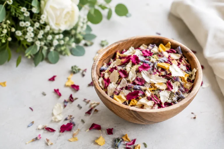
Blush becomes more sophisticated when it is not treated as a sugary accent. Paired with champagne, mushroom and soft brown, it takes on the feeling of old silk, sun-faded frescoes and warm, late-afternoon light. This is especially lovely for a city wedding, a French-inspired celebration or a reception set beneath layered linen and candlelight.
Choose a restrained, petal-like blush with a little grey or beige beneath it, rather than a bright pink. Let brown arrive through timber chairs, chocolate velvet ribbon, tortoiseshell details or naturally toned ceramics. The contrast keeps the palette grounded. It also gives wedding party attire a graceful alternative to matching dresses: taupe, cinnamon and muted rose can sit together beautifully.
French blue, cream and faded sage
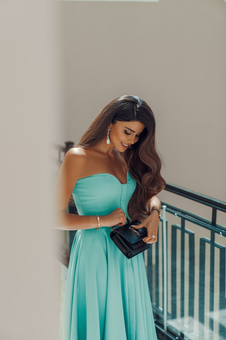
French blue has an effortless quality that feels at home in both a coastal villa and a Georgian manor. With cream and faded sage, it is fresh without feeling overly nautical or overly formal. It can be expressed through blue silk bridesmaid dresses, hand-painted place cards, patterned table linen or a delicate blue border on an invitation suite.
This combination benefits from soft materials. Think stoneware, cotton ribbon, pale wood and loosely gathered flowers rather than high-shine acrylic or strong geometric styling. White delphiniums, scabiosa, cosmos and wisps of foliage give it a meadow-like ease. If the venue has a great deal of warm brick or honey-coloured stone, the cream component will help bridge the cool blue with its surroundings.
Deep claret, rose and candlelit neutral
For autumn and winter, claret offers drama with a sense of permanence. Unlike a true scarlet, it has shadow and depth, making it wonderfully suited to candlelit dinners, velvet textures and historic interiors. Soften it with dusty rose, almond, oat and plenty of candle wax in warm ivory.
The key is proportion. Claret is most effective as an anchor: a napkin, a menu border, a bridal bouquet ribbon, a single floral variety or a richly toned suit. If it is everywhere, it can feel heavy, particularly in low light. Pale linen and reflective glass ensure the room retains a luminous quality, while fruit such as dark grapes or figs can echo the palette in a relaxed, abundant way.
Terracotta, peach and parchment
Earthy tones can be timeless when they are sun-washed rather than saturated. Terracotta, apricot-peach and parchment create a beautiful conversation with Mediterranean stone, dry grasses and the warm skin tones of late summer. It is an inviting palette for a destination celebration, but it can also bring welcome warmth to a British garden wedding.
Keep the orange notes softened by clay, rust or mineral undertones. Parchment stationery, raw silk, natural rattan and cream ceramics stop the look becoming too festival-inspired. Florals might include café-au-lait dahlias, toffee roses, peach ranunculus and small touches of chocolate cosmos. In a particularly colourful venue, use terracotta sparingly and let the architecture take the lead.
Black, ivory and softened metallics
There is a reason this palette returns again and again. Black and ivory are graphic, elegant and remarkably adaptable, particularly for evening celebrations or architectural spaces. Yet its success depends on softness. A crisp black-and-white scheme can feel stark if every line is sharp and every table surface is bare.
Introduce warmth through brushed brass, smoked glass, cream flowers and tactile materials such as velvet, silk and embossed paper. Black bridesmaid dresses can be striking beside a bride in ivory, while black tuxedos remain effortlessly formal. For a less conventional interpretation, use charcoal or ink in place of black, especially if the venue is filled with natural timber or muted stone.
Build the palette around your setting, not against it
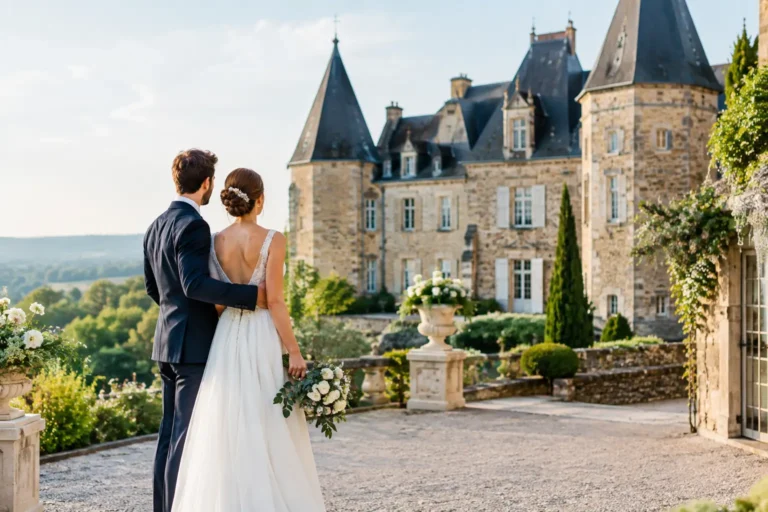
The venue already has a palette: the colour of its walls, flooring, gardens, tableware and surrounding landscape. Working with those elements is one of the simplest ways to make a celebration feel composed. A château with faded plaster and stone invites dusty blue, soft yellow and antique rose; a modern gallery may suit ivory, black, silver and one sculptural floral tone.
This is also where destination planning becomes more intuitive. Rather than importing a heavily themed idea, notice what is already beautiful about the place. The blue shutters of a Provençal hotel, the olive groves beyond an Italian dinner table, or the misty greens around a Lake District estate can become the most personal starting point.
Season offers guidance, but it need not dictate everything. You can wear pale blue in November and claret in June. Still, seasonal flowers and available foliage will affect both budget and visual ease. If you love peonies but are marrying in late autumn, let their soft romance inspire your palette while choosing seasonal blooms that recreate the feeling rather than forcing an expensive substitute.
Give colour room to unfold across the day
Not every wedding detail needs the full palette. The invitation may carry the strongest shade, the ceremony may be almost entirely neutral, and the reception can become richer as dusk falls. This progression feels intentional and prevents the visual fatigue that comes from repeating the same combination on every chair, sign and favour.
Choose one element that feels personal enough to carry your expressive colour. It might be a patterned tablecloth inherited from family, the blue of a favourite holiday destination, or a ribbon shade that recalls the flowers in a meaningful garden. Small repetitions of that note will make the design feel authored, not manufactured.
When you are torn between two directions, create a simple table setting or gather physical swatches before making a final decision. Screens flatten colour, but linen, wax, glass and petals reveal its true character. The right palette should leave you feeling calm, as though every choice has found its natural place in the celebration you are creating.